


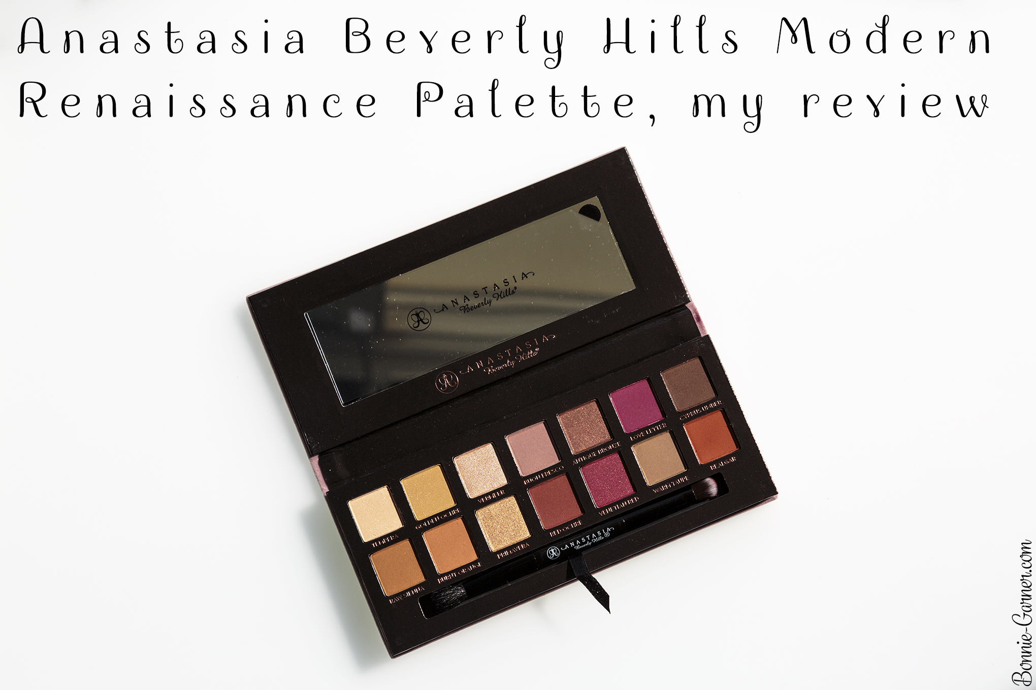
I haven’t been this excited about an eyeshadow palette for a very long time! The Anastasia Beverly Hills Modern Renaissance palette is absolutely stunning and it deserves all the raving reviews it gets!
Well, I guess I just killed the suspense with that intro but, I think you already know it if you’re reading my blog regularly, but I’m usually pretty critical so I really enjoy being genuinely obsessed by a beauty product! bigsmile
The Anastasia Beverly Hills Modern Renaissance palette is, as its name (and the names of the eyeshadows) suggests, inspired by the Renaissance painting. The name of the eyeshadows refer to some pigments used during this time, but also painting techniques or famous Renaissance painters.
The Renaissance was a great period of cultural revival that occurred in Europe during the fifteenth and sixteenth centuries, in the field of ideas, literature, arts and sciences, but also with the economy and social side of things, and that created a shock wave in the religious and political spheres. This period is associated with the rediscovery of literature, philosophy and science of antiquity, and a starting point was the Italian Renaissance. Italy was indeed the central point of this movement and you can really feel it has inspired the Anastasia Beverly Hills brand, be it in the choice of colors or the names of the eyeshadows.
The colors of this palette make me think about the sublime Italian cities (Florence, Siena, Arezzo, aka Tuscany<3 heart <3) with all this harmony of reds, oranges, dark pinks, browns and ochre colours. These cities were often used as background for the beautiful Renaissance paintings but I was lucky enough to visit them for real and I can assure you that the colors are as stunning in real life that they are in the painting! wink
But still, even if I find these colors super beautiful, as soon as I received it, the first thing I wondered was if these colors were wearable with a fair complexion like mine.
On medium, golden, dark skin, no worries, these shades work perfectly! But on a light skin, I had some doubts…
Well, not anymore! smile
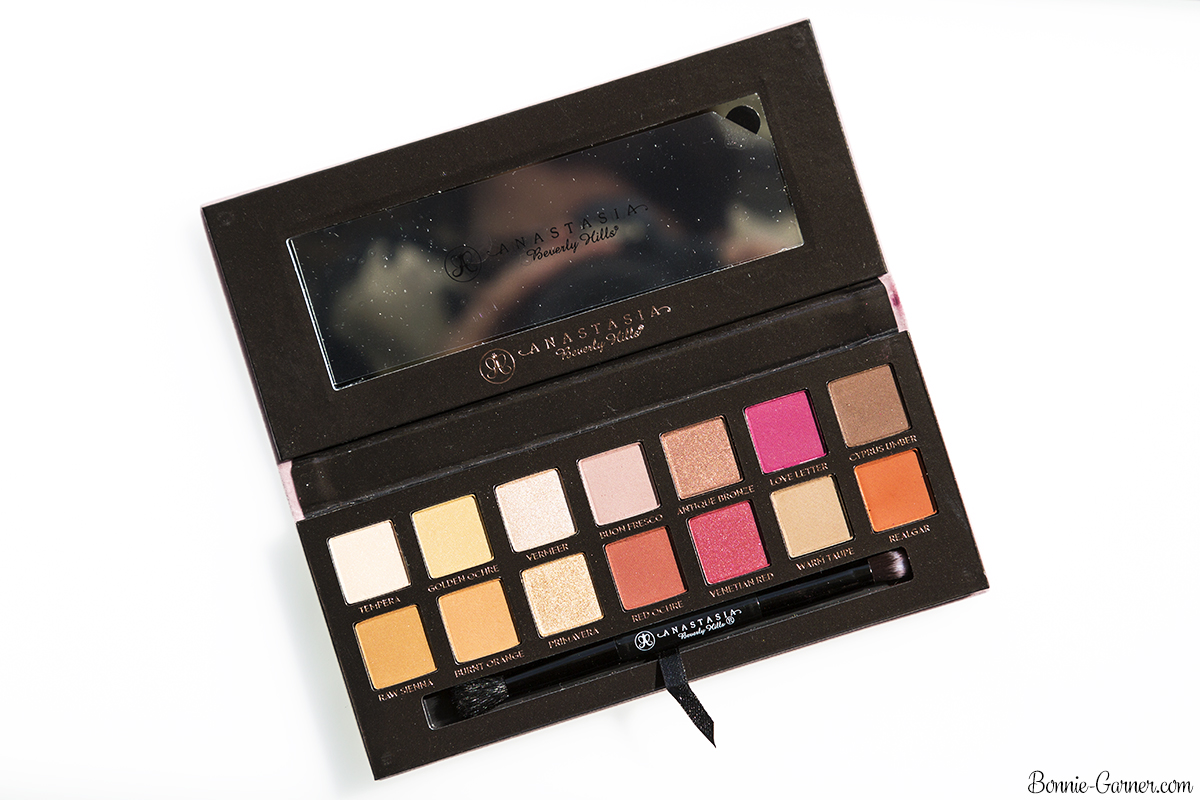
Anastasia Beverly Hills Modern Renaissance palette, presentation:

What the brands says about it:
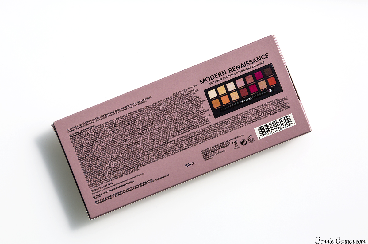
“An essential eye shadow collection featuring 14 shades, including neutral and berry tones. Use Anastasia Beverly Hills first permanent palette, Modern Renaissance to create endless looks for daytime and evening.
Highly pigmented, easy-to-blend formula.
11 matte shades, 3 metallic.
Dual-sided soft bristle brush“
Seeing the palette for the first time, I thought it was composed mostly of warm eyeshadows but when I actually started to use them, I realized that a lot of them were actually quite neutral and even with cool undertones. This palette conceal its hand nicely! wink
Most colors are new and exclusive to this palette but 3 of them are already available in single format (Burnt Orange, Buon Fresco and Warm Taupe) (I own these 3 eyeshadows already and I love them!).
So there are lots of ochre and red tones, and although the brand speaks of a Renaissance inspiration, it makes me think of the colors of 90’s makeup.
And well, it’s been at least 2 years that 90’s makeup has been making a comeback! Until now, I have mostly seen it on the lips and that’s it, but now it also influences eye makeup, apparently!
I must admit that the first time I did a ochre eye makeup look with this palette, I wondered where my choker necklace was from back in the days! wink
In my opinion, the Modern Renaissance palette is not a palette for those who want a neutral make-up for every day. This palette wouldn’t necessarily be the one I would take with me on holidays, for example (I love my simple neutral boring makeup looks when I’m away lol).
However, if you passionately love makeup and you want a trendy colored eyeshadows palette, this is it!
Anastasia Beverly Hills is so on point with colors and trends, I have already mentioned it several times in my other posts on the brand. For me, this brand is really a trend setter and they also definitely master the art of color! And something tells me you’ll see a lot of red and ochre eyeshadows in the next autumn-winter collections from the other brands! wink
The formula of the eyeshadows in the palette reminds me of the ABH single eyeshadow I own. They are very creamy, they’re even “softer” in their texture but I also find them quite powdery. Overall however, it’s a great formula!
Anastasia Beverly Hills Modern Renaissance palette, my test and thoughts:

– Packaging and practicity:
I’ll start with what I like the least in this palette. wink
I can’t really understand the choice of this velvet like packaging… The soft pink color is quite nice but the kind of faux-suede finish ends up catching dust like nobody’s business and will inevitably end up being stained with eyeshadows (after a week of use, it was already dirty -_- ) Why, Anastasia, why???
Otherwise, it’s a classic cardboard palette with a mirror, which is always handy and a double brush tip (which is not great, the bristles are shedding super easily…). So in short, nothing super exciting on that side.
– Color choice, finishes and versatility:
As I said above, the choice of colors will clearly please the makeup lovers (you can really achieve a lot of great makeup looks with this palette), but also those who want trendy and modern makeup looks.
The color range is perfect for all skin tones and I would say it’s a perfect palette for medium to dark skin tones. However, it’s also perfect for fair skin tones, but clearly it’s quite a bold color selection. However the colors, even if they’re quite bright, are still very wearable and flattering!
Some colors seem to look alike when you look at them in the palette (such as Raw Sienna/ Golden Ochre/ Burnt Orange or Venetian Red/ Love Letter) and it’s true that they’re close but as you will see on the swatches, they look different on the skin. Even if they clearly are in the same color family, they’ve got different undertones so you can create a full range of different makeup looks!
Regarding the finishes, the brand speaks of 11 mattes and 3 metalics. I would rather say that it contains:
– 8 real mats: Raw Sienna, Burnt Orange, Buon Fresco, Red Ochre, Love Letter, Warm Taupe, Cyprus Umber, Realgar,
– 3 luminous mats (presque satinés): Tempera, Golden Ochre, Venetian Red,
– 1 shimmery: Antique Bronze,
– 2 metallics: Vermeer, Primavera.
This choice of finishes is absolutely great and allows tons of different associations and makeup looks!
– Overall quality of the eyeshadows:
I found the overall quality of the eyeshadows very good: they are ultra creamy, easy to blend and the pigmentation is excellent.
However, they are quite powdery, so you need to remember to tap your brush to prevent fall outs on your cheeks!
Also,when I swatched Love Letter for the first time, I thought that the pigmentation was quite weak compared to others but in fact, it performs very well on the eyelids and it has a good pigmentation!
– Value for money:
The value for money of this palette is pretty good, it contains 14 eyeshadows for $42 so it’s a fair price tag, IMO! wink
– Availability:
The palette is part of the brand permanent collection and it’s available on Anastasia Beverly Hills‘ website, but also on Cult Beauty and in Dubai, it’s already been available at Sephora for a few days now (RUN!).
Anastasia Beverly Hills Modern Renaissance palette, the colors:
– Tempera: a flesh color, very luminous.
– Golden Ochre: it’s a very light beige ochre yellow. It’s a real matte and it’s stunning all over the eyelid or in the crease.
– Vermeer: a beautiful champagne, slightly pink and very metallic. It really catches the light.
– Buon Fresco: a beautiful dusty mauve matte eyeshadow quite muted, it’s still a neutral shade. I have a weakness for these kind of colors in the crease or all over the eyelid.
– Antique Bronze: a beautiful color, much more complex than it first seems. It’s a neutral brown with pink undertones but it can sometimes look taupe, sometimes bronze depending on the light. It’s a shimmery eyeshadow. For me, this is the perfect shade for a simple and effective makeup look, especially paired with Buon Fresco in the crease! wink
– Love Letter: a lovely raspberry pink, very bright. Maybe not the eyeshadow I would wear the most, but it’s surprisingly wearable when it’s paired with the other colors in the palette! I really like it!
– Cyprus Umber: a beautiful neutral dark brown that really helps to intensify all the makeup looks.

– Raw Sienna: a beautiful matte amber, very luminous.
– Burnt Orange: an orange shade with a light ochre undertone, perfect as transition shade for very intense and dark smokey eyes or even used by itself on the entire eyelid.
– Primavera: a very metallic light gold, perfect to highlight an inner corner or the center of the eyelid.
– Red Ochre: a beautiful matte orange-red, almost like a Sienna pigment, very warm and intense. One of my favorite color in this palette!
– Venetian Red: a stunning and deep matte crimson, with very fine iridescent particles, which makes it very luminous.
– Warm Taupe: a beige brown color, slightly taupe. It’s a matte finish.
– Realgar: this color scared me at first, but on the eyelid, it’s really beautiful and actually quite easy to wear. It’s a beautiful orange brick, almost sienna. It’s a matte finish.

Finally, here are the swatches of the entire palette:

And several makeup looks made with this palette:
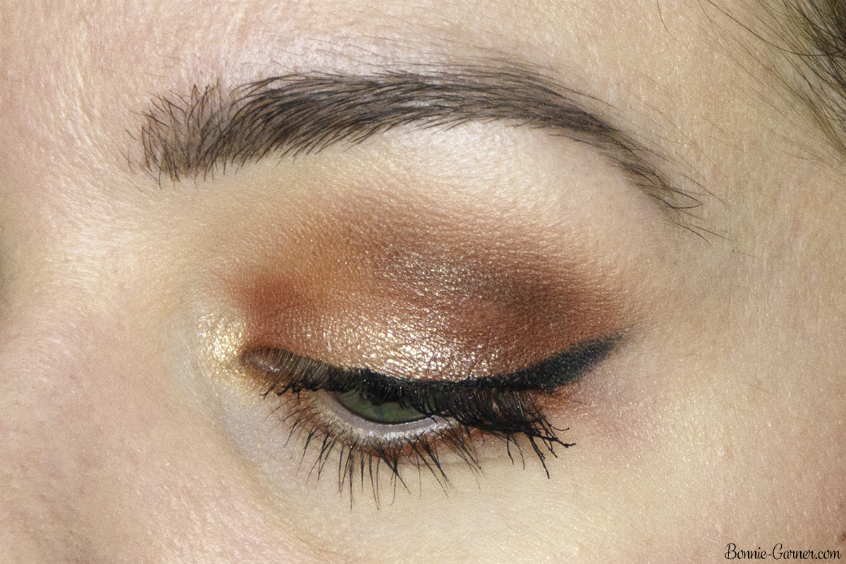
– Look 1:


For this look,I applied Tempera as a base all over, Buon Fresco and Warm Taupe in the crease, Antique Bronze all over the eyelid, Cyprus Umber in the outter V and along the lash line and Vermeer in the inner corner.
My lipstick combo here is also from ABH, it’s the matte liquid lipstick Crush with the lip-gloss Kristen on top.
– Look 2:

I applied Tempera all over as a base, Burnt Orange in the crease, Cyprus Umber in the outter V, Realgar and Red Ochre as a halo on the side of the eyelids, Primavera on the middle of the eyelid and in the inner corner. My black gel liner is by Inglot.
On my lips, it’s the Lippie Stix Sheer Kiddo by ColourPop (I love it so much, it’s almost finished, can you believe it???)
– Look 3:


My 90’s makeup look! wink
I applied Tempera all over, Raw Sienna in the crease with Warm Taupe to intensify, Golden Ochre on the eyelid and Primavera in the inner corner. My liner is the Charlotte Tilbury Bedroom Black blended.
On my lips, Velvet Teddy by MAC.
– Look 4:


I applied Tempera as a base, Buon Fresco in the crease, Love Letter is the star of the show here and it’s on my entire eyelid, Cyprus Umber is in the outter V and along the lash line, mixed with Love Letter, and Vermeer in the inner corner. I also used Costa Riche by MAC in the waterline.
On my lips, it’s the Vice Lisptick in the shade Sheer Liar by Urban Decay.
In summary:
[wprs-pros][wprs-cons]
I’m obsessed with this palette. The selection of colors is beautiful and really unique, IMO. The quality of the eyeshadows is absolutely great. And I think it’s so cool that it can really suit all skin colors for once! smile
The Anastasia Beverly Hills Modern Renaissance palette is available on Anastasia Beverly Hills website for $42 or on Cult Beauty (it retails for 41£).
And it’s already available in Sephora in the UAE, yeaaah! bigsmile
Did you know the Anastasia Beverly Hills Modern Renaissance palette? Do you like the color selection?
Photo credit: bonnie-garner.com